web + mobile visual rebrand
A rebrand across web and mobile working as a designer, dev, and PM.
Problem
Challenges

How it started...
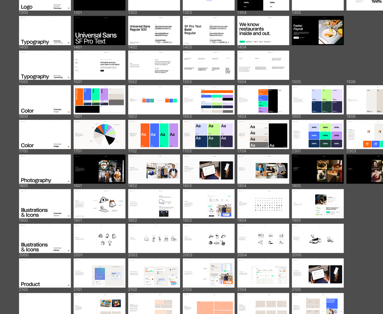
figure 1
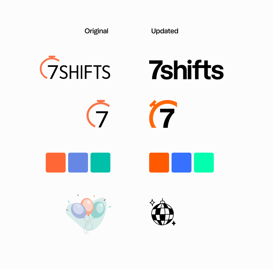
Guidelines from the agency
The guidelines were very high level, including only font, colour palette, imagery style with set libraries to pull from, and logo information.
The guide was missing guidance around details such as border radius changes (all examples were inconsistent) or examples applying the high level changes to the product on any platform.
It was up to me and my team to determine how to apply all these style changes to the product.
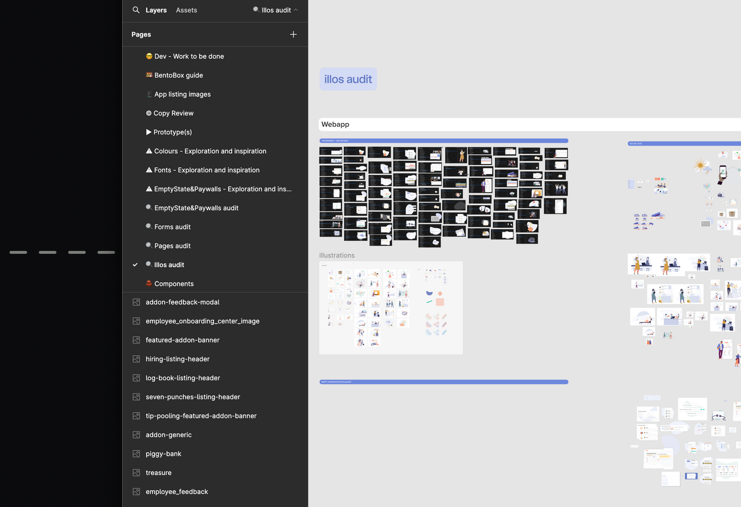
Figure 3
So many audits
I completed a handful of audits on things like common pages, imagery, forms, and empty states to understand the state we were currently in and what work we'd need to do to apply any holistic rebrand changes.
These audits also helped later on with exploring rebrand changes and catching any edge cases we'd need to consider.
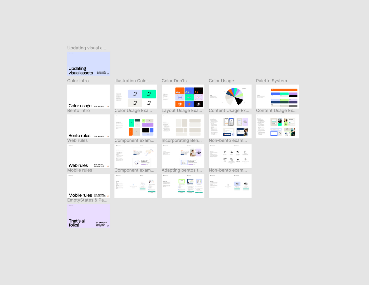
Figure 2
Visual assets guide
The imagery style switching to a bento layout required redesigning all empty state images, which included over 150+ empty states.
I made a guide with guidelines, examples, and links to our new asset library for the team to help guide us while redesigning all of our empty state images. This guide remains as a resource for designers now that each designer has to create any net new imagery for their domains.
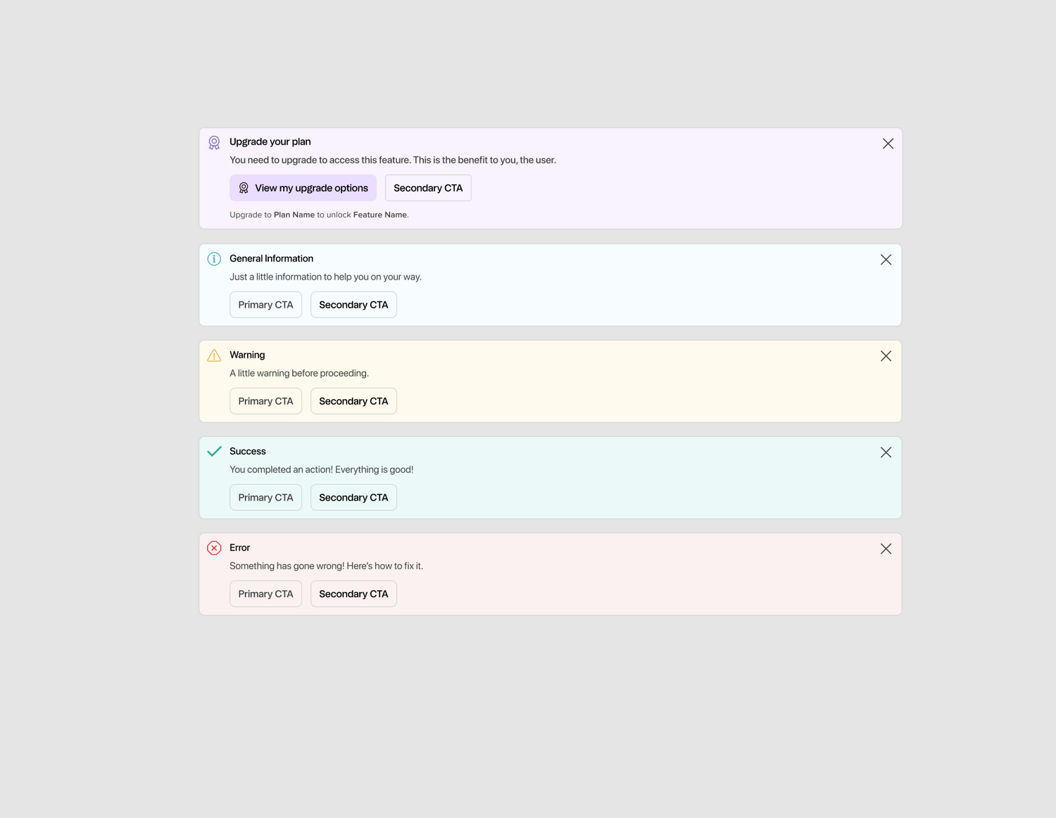
Figure 5
Status colours
We have five statuses: upsell, info, warning, success, and danger. The agency had no mention of status colors and our previous upsell color was removed in the new palette. We had to look at all our new palette to determine what would take it's place.
Four of the five thankfully didn't need changes, so it was just upsell that needed an answer. From the colours available the new lime was too bright for what we wanted and the new blackberry replaced our previous eggplant blue, so those were off the table. That left the new eggplant purple.
After sharing it with the product team we were all happy with trying it out as our new upsell color across the apps.
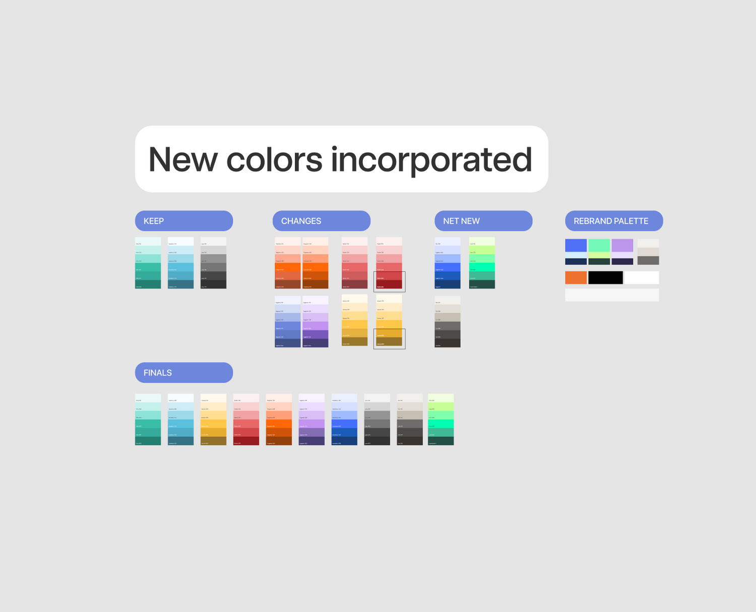
Figure 4
Full colour palette
The new brand colours only included three shades for each, but in order for them to work with certain UI elements in our design system we needed a full six shades for each. So, I had to determine the missing three for each by comparing to the others, using it in context, checking contrast between certain levels to ensure it's still AA accessible, and sharing with designers to eventually get a palette that we were happy with.
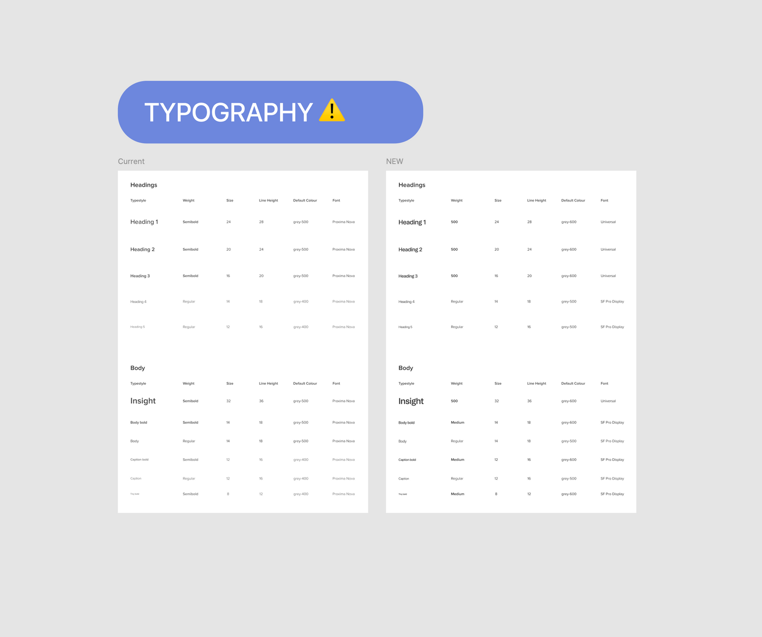
Figure 6
Typography updates
We got two new fonts to play with, with general guidelines that one is for headings and the other is for body text, and all text should be black. But the way we use our text styles in the product didn't exactly line up with these simple rules.
After trying a few versions we landed on a set of rules that was aligned to the brand guidelines of headings vs. body, while still working well with how we use each text style in the product.
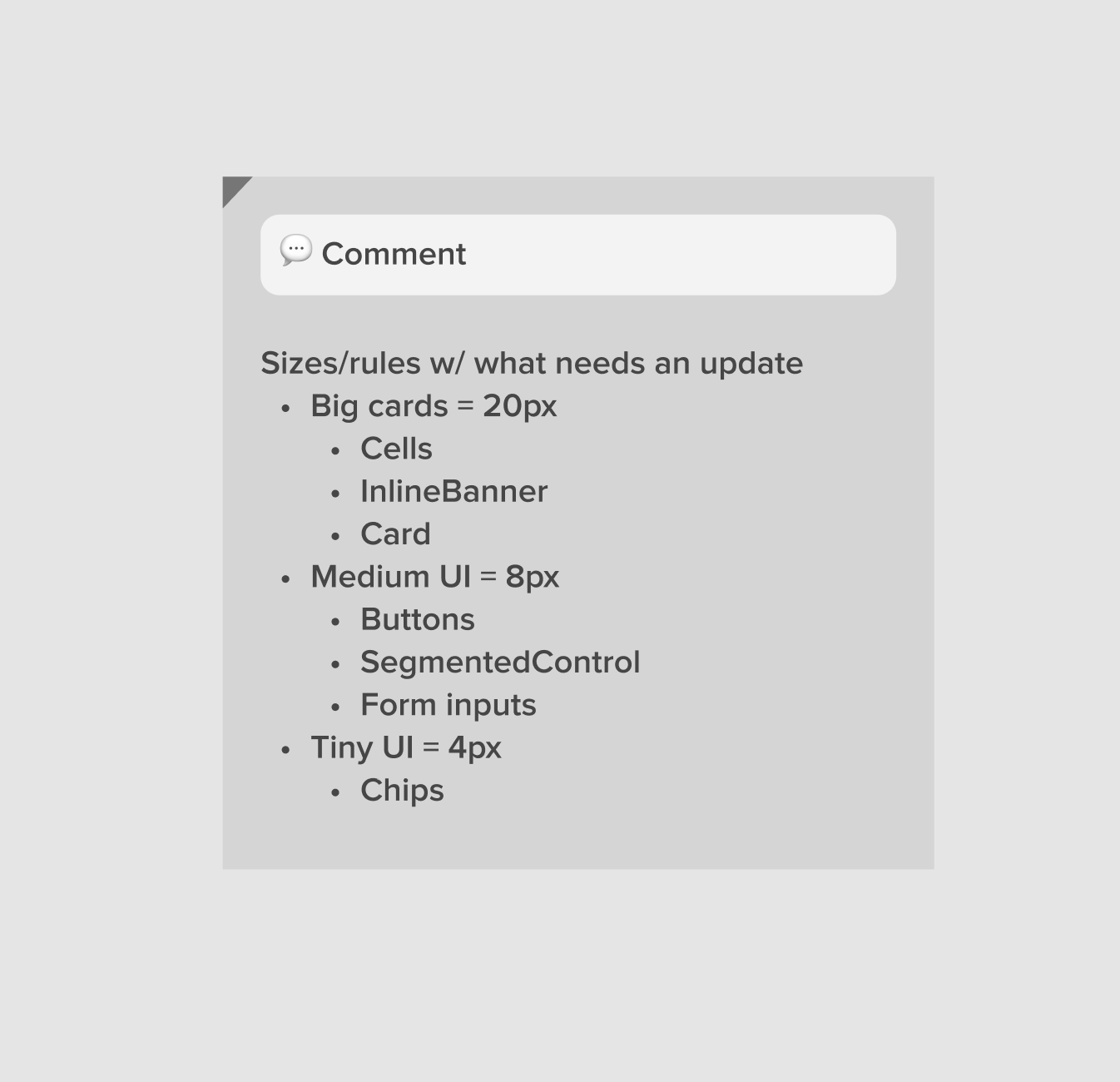
Figure 7
Border radius
The examples we were given were much more bubbly, but had different border radius values across screens and even within the same screen would be slightly different. When we asked they didn't have a set value they were using.
Using the audits mentioned above I made a handful of screens in Figma that covered ~95% of our web and mobile app UI. Using these screens I narrowed down our elements to require three border radius tokens and understood how each was generally used, and then determined the value for each.
To determine the value I played around with our multiples of four rule until the three tokens used across the screens matched the border radius look that was in the rebrand guide.
Web and mobile were able to follow the same rules for the three border radius tokens but mobile had smaller values since that experience is at a smaller scale.
How we implemented the changes