Sous Chef design system
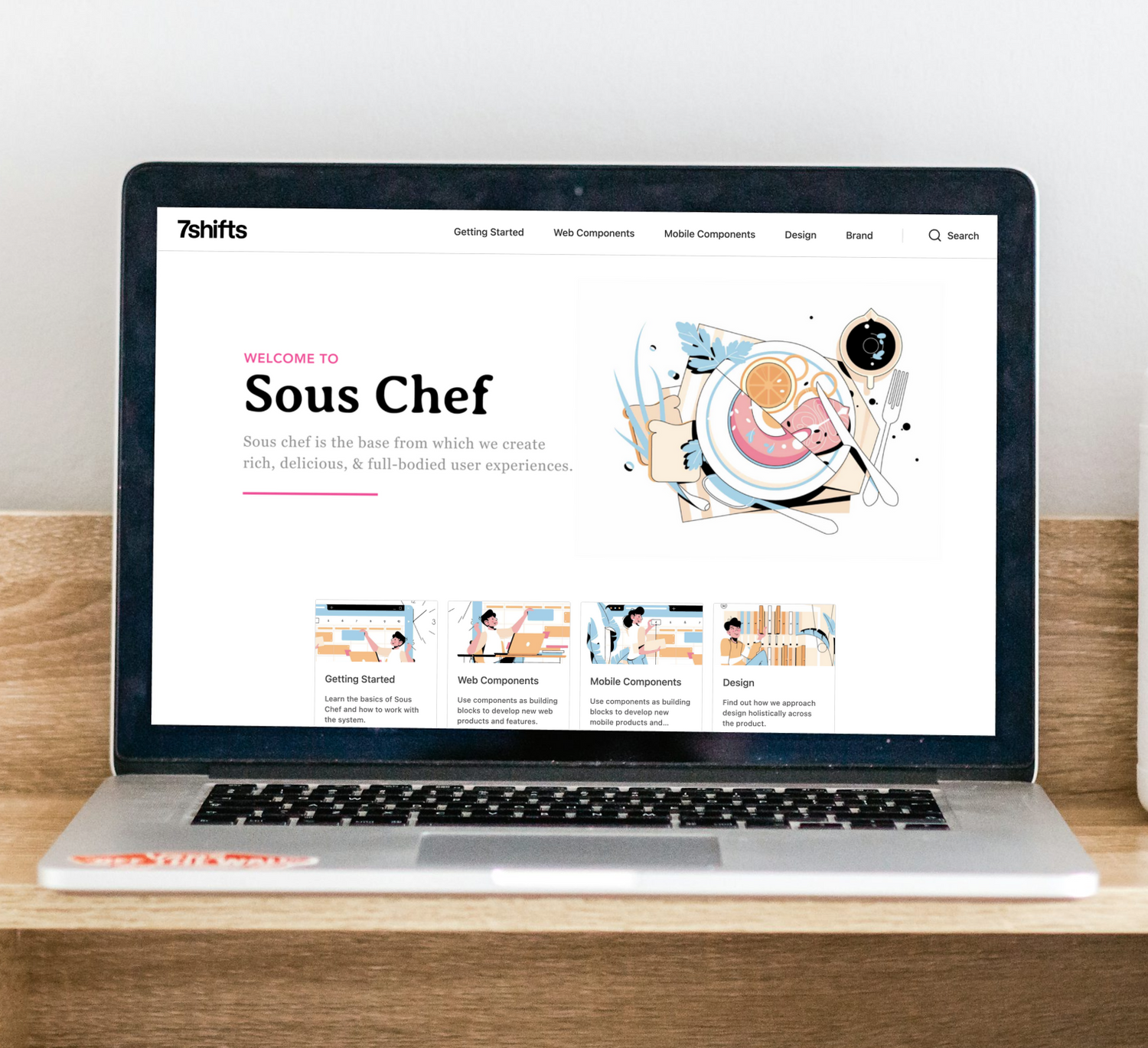
The design system used by the 7shifts web and mobile apps.
Problem
As the product team got larger it became challenging to stay in alignment on details like how we used spacing, colour, various components, etc., as well as basics like what components exist, which have been built in code, how they work, things like that.
This problem was causing extra dev and design time on every team, while also creating an inconsistent experience for our end users.
SO, WE NEEDED A SOLVE THAT:
- Allows teams to focus on customer value rather than inefficient UI work
- Mitigates future design/tech debt
- Creates a single source of truth
- Ensures brand cohesion
Goals
-
Increase velocity
Speed up the design and development process.
-
Improve experiences
Create great experiences for both the customer and the internal teams.
-
Streamline communication
Create efficient methods for cross-department collaboration.
Challenges
The things you always hear with design systems is time, capacity, providing clear business value, maybe something like "there's so much to do but we never have time to work on it".
1. TIME & CAPACITY
This challenge has never left us. To this day we only have one designer (me) and one developer who owns Sous Chef. And of course we both work on other things as well.
The never ending to-do list never leaves you either, as packages or tools update the game continues on.
One of our biggest challenges has been learning how to organize and prioritize this ongoing to-do list to make sure the most valuable things that need to get done happen.
2. CLEAR BUSINESS VALUE
It's hard to convince a product to stop spending time on something that will make them money. Design systems are one of those things that don't obviously make money, and are hard to prove that they do, but I strongly believe they do in the long run (and are worth more $$ the earlier you start!).
At a certain point if you're building without one it just becomes impossible to keep at the same velocity while expecting the same cohesive, consistent, easy to use product.

One solution -> many users
Sous Chef is used by all of product which means it needs to be usable for designers, engineers, product managers, data analysts, product marketing, and so on. Each person with different goals and needs.
User needs
-
DESIGNERS
- What components are available and how they should be used.
- Holistic UX guidelines like product principles or voice and tone guidelines.
- Holistic UI guidelines like spacing, colour, typography.
-
DEVELOPERS
- What components are available and how to use them to recreate design mocks.
- What design tokens are available and how to use them.
- How to use the component library
-
THE REST OF PRODUCT
- At a glance, high level information.
- Used as the source of truth, reference, or a decision maker in projects.
Competitor Analysis
To this day whenever we update Sous Chef we still use these design systems as a reference to understand what others do and how they do it.
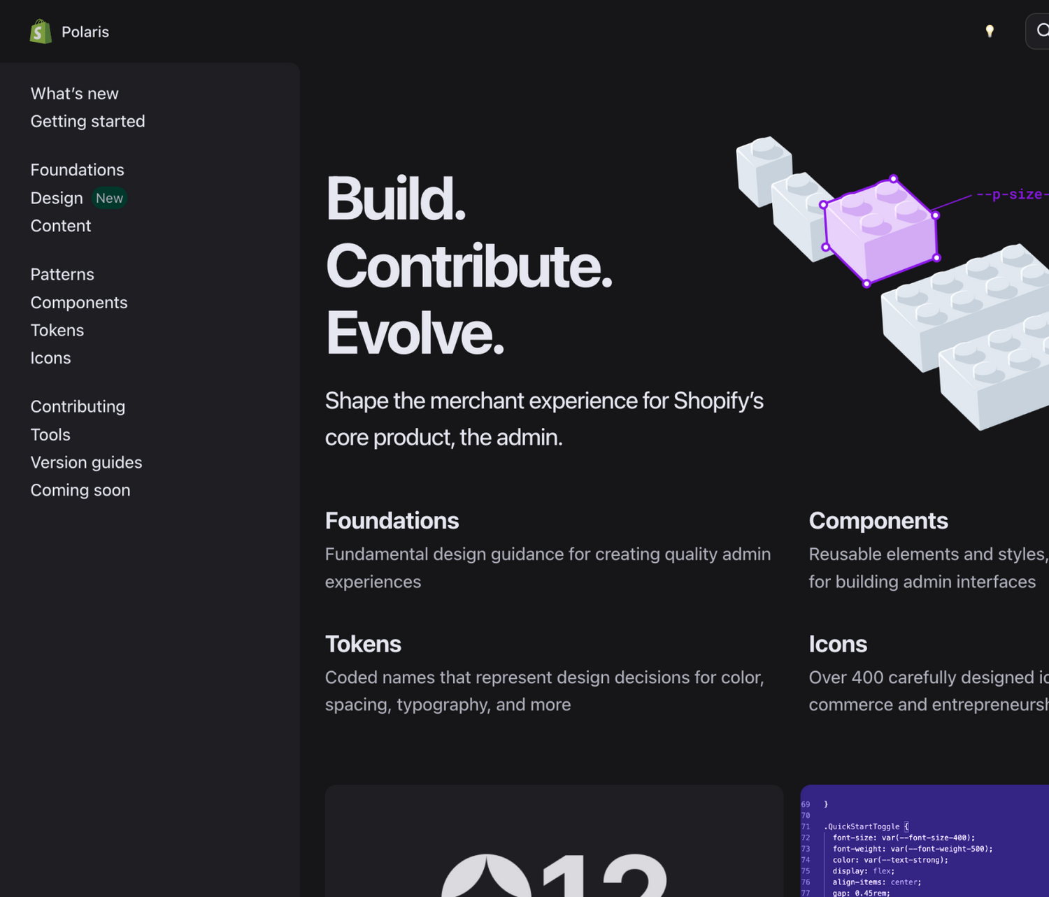
Shopify
Polaris
One of the most robust web design systems we've come across. It features docs for almost every component you could need, all built responsively with a beautifully organized design token layer to keep things easy and scalable.
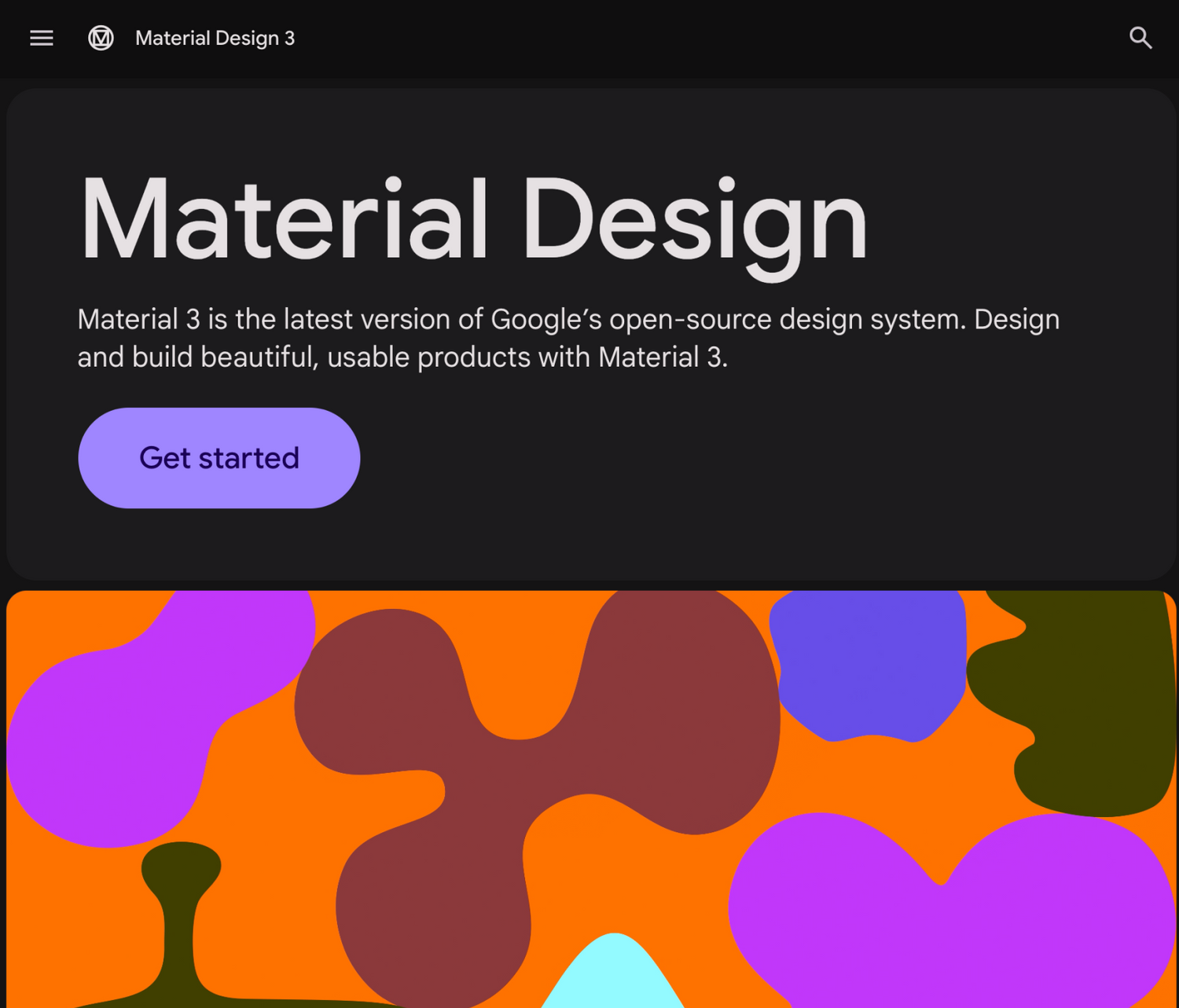
Material 3
Google’s open-source design system that's been around for years and for good reasons. It's riddled with tons of in-depth UX guidance to reference, and is a jackpot for building Android products.
Story time...
How the Sous Chef train officially started back in 2022.
We had no idea how to do things or what tools to use, but we knew we needed to start somewhere.

THE FIRST COMPONENT: RESOURCE TABLE (2022)
In order to create the first component, we needed to understand what and how to build it first. We decided on building a table because tables were commonly used but the usage in code and design wasn't super clear or easy to use (i.e. existing design + tech debt). There was three different, yet almost identical tables to get an idea of the problem.

FIRST PHASE: RESEARCH
I completed an audit (Figure 1) of all the instances where we used a table to understand how we used it, what needs we had, what things we could simplify, and so on. My dev counterpart did his research by looking at competitors (like those above) to see how they built their tables, what options they provided, so on. Then the two of us met to share our findings and decide what exactly we wanted to build.

SECOND PHASE: IDEATION & FEEDBACK
Then, I created some design mocks and a rough design guidelines template to share with the design team to get feedback and ensure we had alignment on what we wanted to build. In this time my dev counterpart talked with eng folks to determine technical details around how we wanted to organize and build the components. Then, after revisions on both sides we had enough requirements to start building. My dev counterpart made the ticket, the two of us went over the tech AC together to make sure things looked good, and then we were off.

FINAL PHASE: SHIP IT & SHARE IT
In the span of a couple weeks the first Sous Chef component had been created. We deprecated the three now legacy versions, shared in Slack that it was created, and slowly helped teams migrate their old tables to the new one. We didn't have documentation yet, but we finally had our first reusable component with dev <> designer alignment.
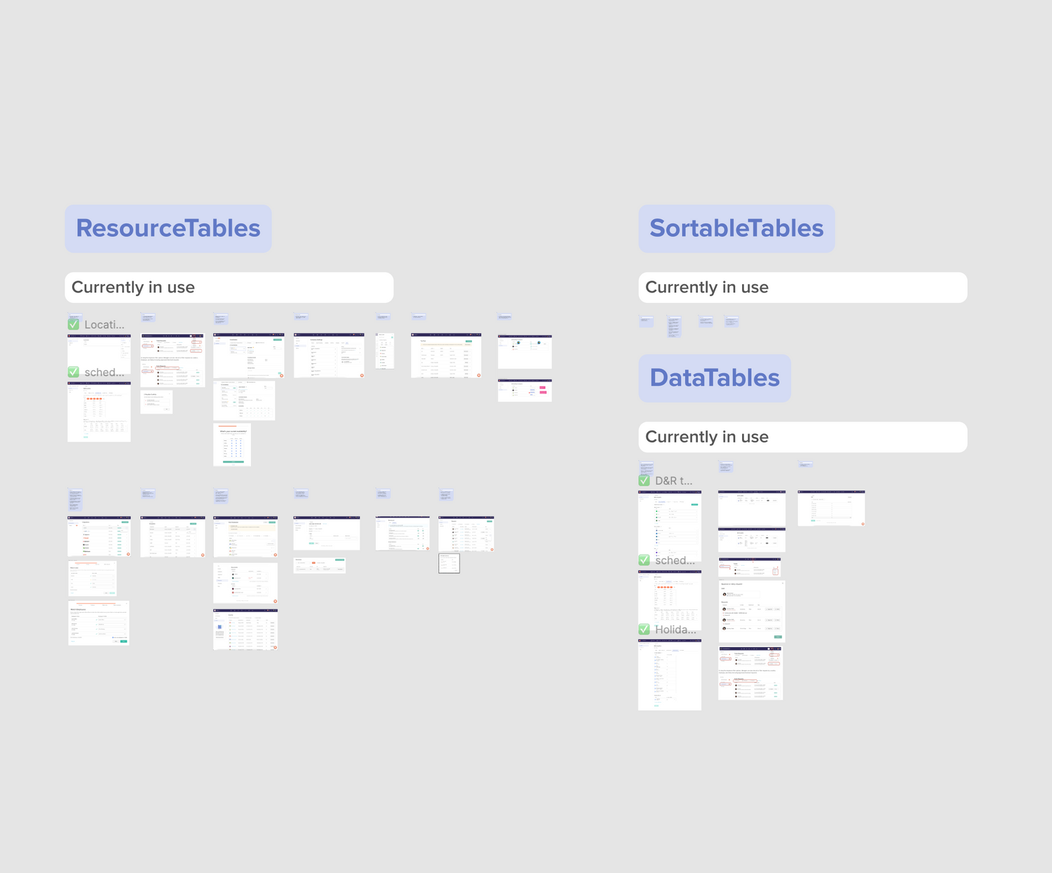
figure 1
Tables audit
As I reviewed each table I left notes of things like functionality and layout usage to ensure the new component covered our needs, while also noting things that could be consolidated to simplify it's usage and speed up dev time creating it.
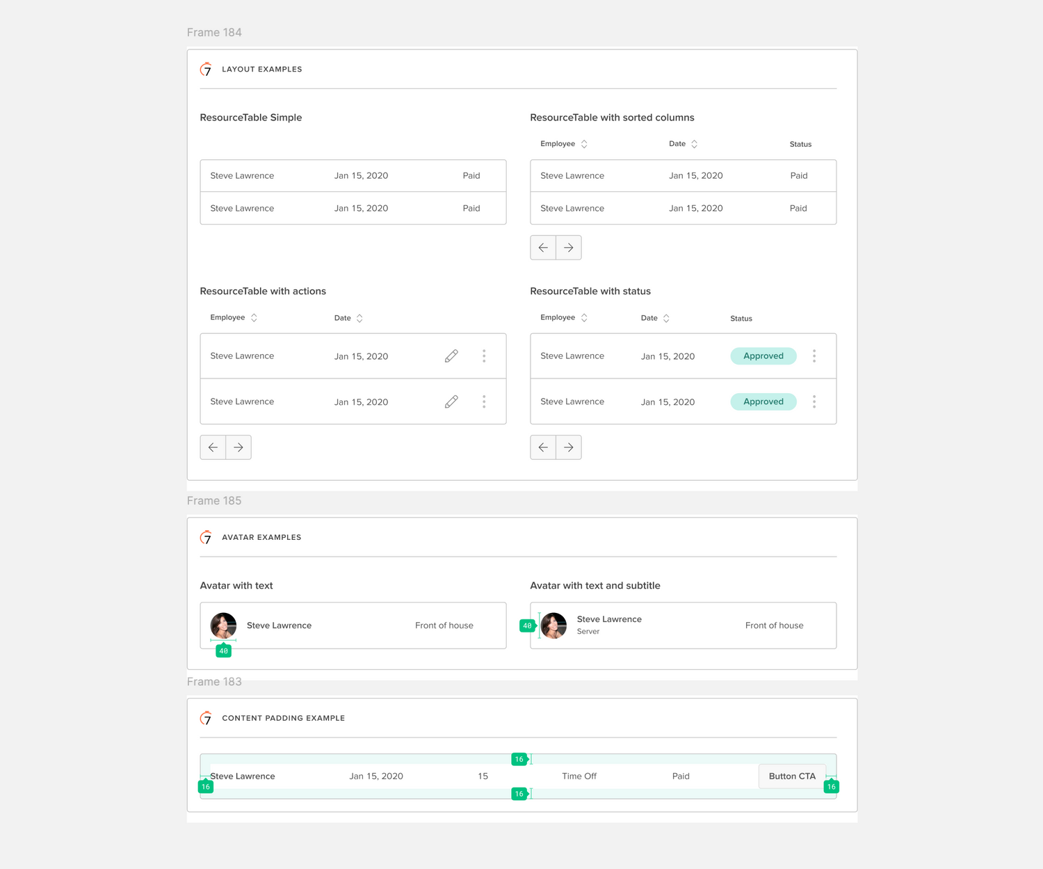
Figure 2
Common table use cases
After researching how other design systems did tables as well as how we were using tables, I created some mocks and shared with the design team to start the review process. Once I made some revisions based on feedback we were left with these common use cases.
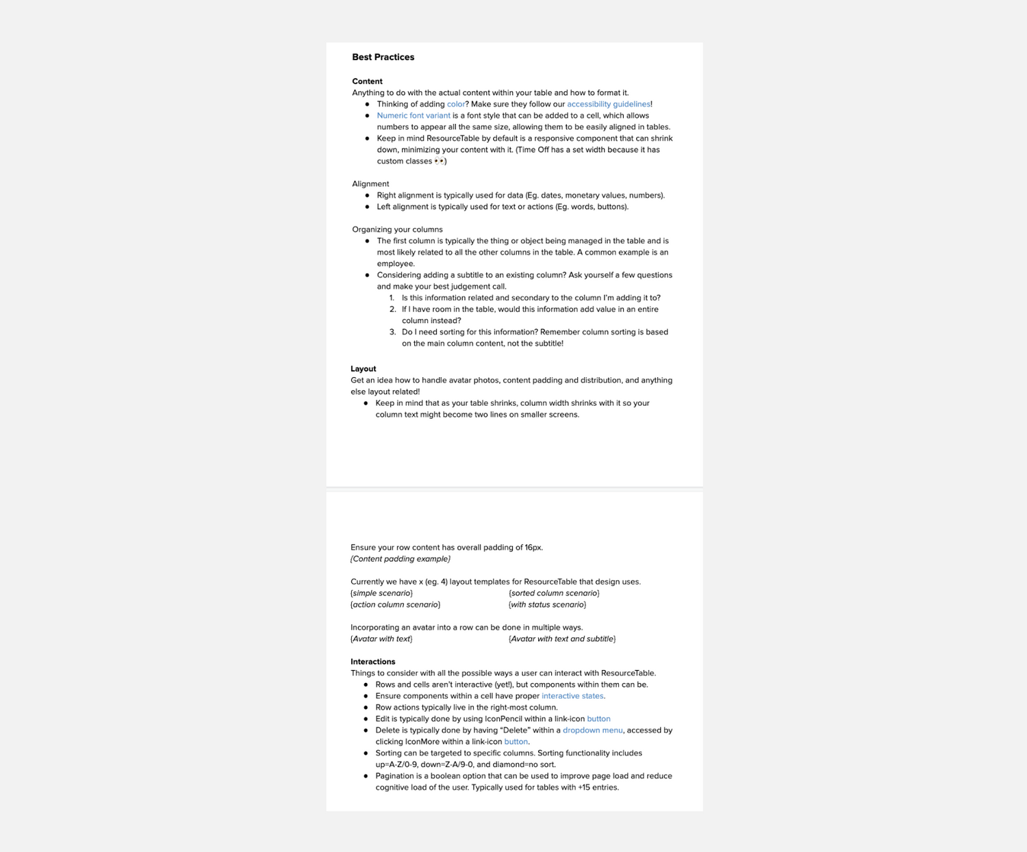
Figure 3
Our first design guidelines doc
The first few component guidelines were written in Google docs and shared with the team to get feedback. I'd write everything I could think of, heavily inspired by other design systems docs, and the designers would comment away with any feedback they had.
What we learned
-
DO'S
Do your research before you get into the weeds.
- Understanding how other design systems do things was very helpful. Now after making over 50+ common components, I'd say most of them had very similar implementations across 3+ design systems we'd review.
- Understanding how we use the component, what our needs were, what we could cut or consolidate, things like that made the requirements and design work much simpler and quicker.
Having new components in a separate code repo
- Keeps it clear which things are new vs. legacy
- Ability to configure CI to suite our needs without bloating the 7shifts repo. For example, we introduced Chromatic later on for visual regression testing.
- Ability to have the repo public for anyone to use while the overall 7shifts repo can stay private.
Start with high value components to quickly show the value of a design system
- Shipping high value components has a better chance of actually being used and noticed, thus increasing velocity and adoption.
- The more you prove it's helping, the more likely you'll get capacity to work on it. Eventually people will rely on it and need to have maintainers for it.
-
DON'TS
Creating guidelines from scratch isn't scalable for every component.
- Action item -> make a template that covers most things that could come up. This ensures we don't forget things while speeding up the process.
Guideline sections could be unclear around what content you'd expect to find there.
- For example, what exactly should I put in "Best practices" or "Usage" ?
- Action item -> add a subtitle to each section title in the template to make reading and filling it in simple and clear.
Have documentation and announcements only in Slack / shared Google Drive
- People forget these things easily and have a much harder time finding them later on.
- Google docs and md files don't cover all our needs and are disconnected. We needed diagrams, images, functional examples to see how components work, etc., available for both devs and designers.
- Action item -> find a solution for hosting documentation for both devs and designers (primary users).
Fast forward to today...
These three phases of research, ideation & feedback, and ship it & share it mentioned above generally stuck with us and have worked really well.
COMPONENT LIBRARY
Today we have just short of 60 components in our web library, and the mobile library has just recently started to officially be maintained with just under 30 components across both our iOS and Android libraries.
DOCUMENTATION
Our guidelines for both devs and designers have been migrated to Zeroheight (Figure 4), a documentation tool made especially for design systems. Our web library uses Storybook (Figure 5) to document code examples which integrates with Zeroheight so it can all be found in one place. Web also uses Chromatic (Figure 6) to test and compare visual changes for every update to ensure we don't introduce any unintentional updates.
PRIORITIZATION
In one way or another we've always logged any backlog tasks in a Jira board. Backlog items would come from internal and external folks, typically shared in Slack.
To prioritize this backlog another designer and I would go through any new items every sprint and plot them on a matrix (Figure 7) that mapped impact vs. scope. Then we'd create the next sprint for me that'd include a balance of high value, low scope, with a bit of high value, larger scope items to ensure things wouldn't sit for too long. Today I do a similar exercise but with my developer counterpart.
ADVOCATING & COLLABORATING
Even though Sous Chef is only owned by two people (soon to be four with mobile!), it's something that's always been open to anyone in product to collaborate on, evolve, and ultimately work on.
Without this mindset we wouldn't be where we are today. Opening the door to everyone has helped get updates shipped that we wouldn't have capacity for otherwise. It's also improved other things like understanding, ownership and advocating for the design system. If a team wants an update, they just have to share their idea with us in our Sous Chef slack channel and we chat about it, determine if and how we want to do the update, and help review it to get it out the door. And of course we give first time contributors a shoutout just to make it fun. The slack channel is also where folks do things like ask questions or share interesting articles or patterns.
It's a win win that I'm incredibly proud of now, to get to this point of anyone being able to easily contribute and many folks advocating for the design system as if it's their own. It's become a tool that we just couldn't go without.
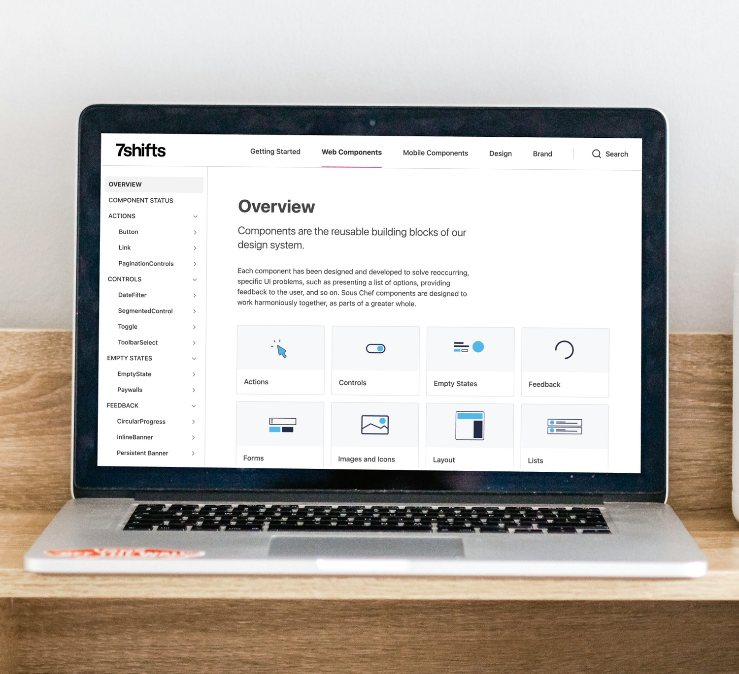
Figure 4
Zeroheight AKA Sous Chef
Our web library with just under 60 components, all available for public use in other projects. Fun fact: I used Sous Chef in my final year university project!
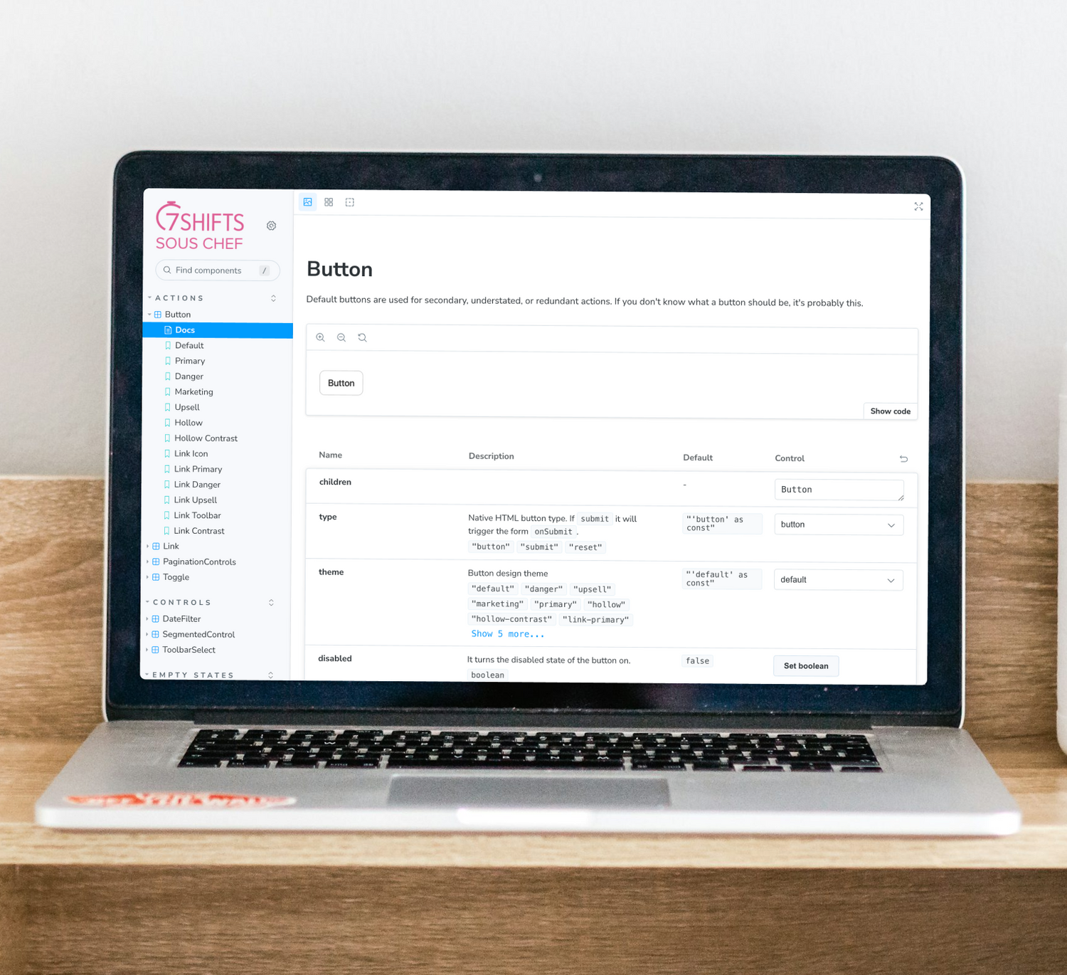
Figure 5
Storybook
A code documentation tool made by Zeroheight that provides an easy way to document "stories" aka working code examples. Currently only available for web libraries.
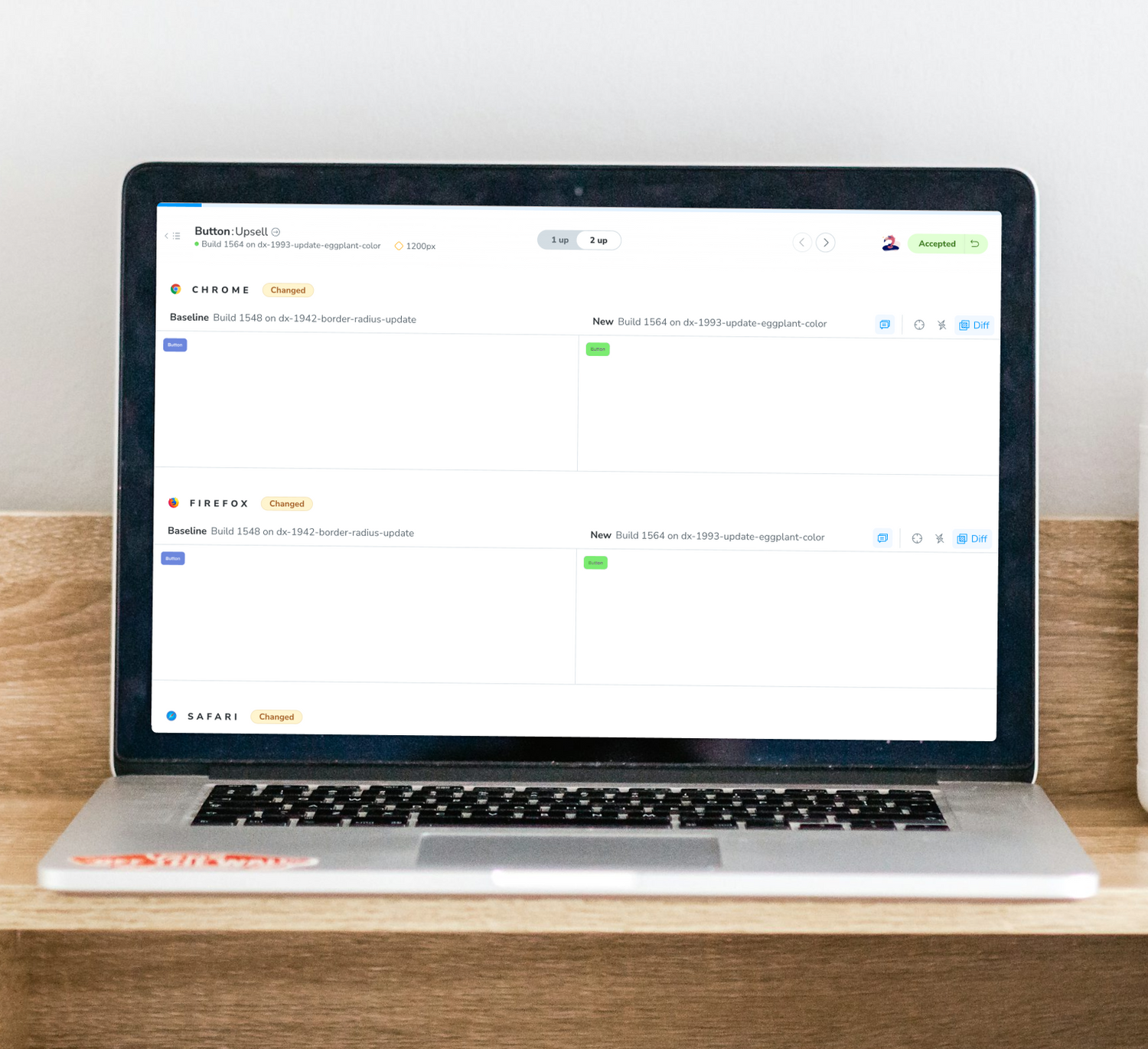
Figure 6
Chromatic
For every PR into master we have a Chromatic CI check where Chromatic will flag any visual changes across all common browsers. I have to review and approve these changes in Chromatic before the CI check will pass and then we can merge the update.
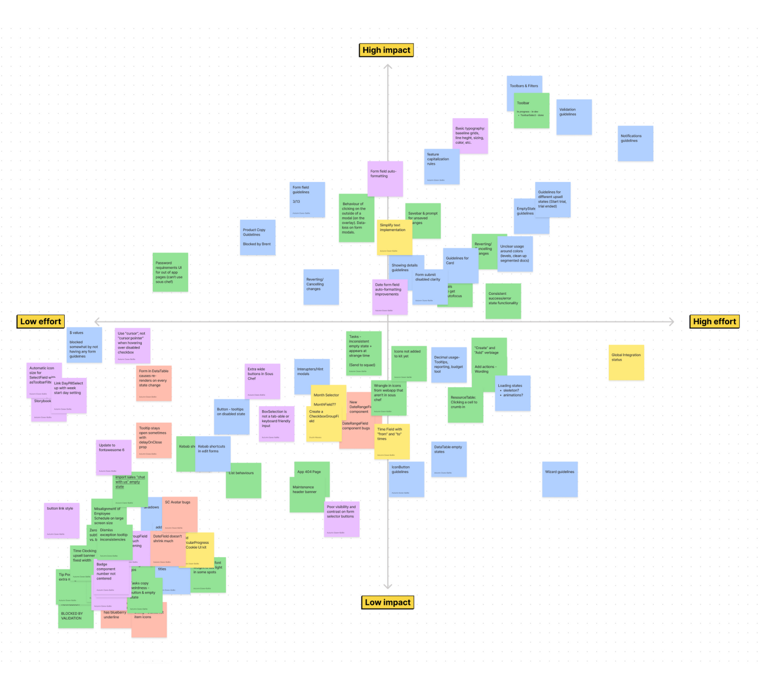
Figure 7
Prioritization matrix
Sticky colours helped organize the categories for each type of task. The categories were: guidelines, design debt, bugs, enhancements, and new components. Every few months we'd review the matrix to determine if any stickies needed to be re-adjusted.

In conclusion
Sous Chef is an ever evolving project. What a journey it's been. I'm excited to continue finding new ways to improve, learn, iterate, and maybe even look back on and laugh or shake my head at...all the great things that come with design.